experiencing
information
through
Wim
Crouwel
the new alphabet
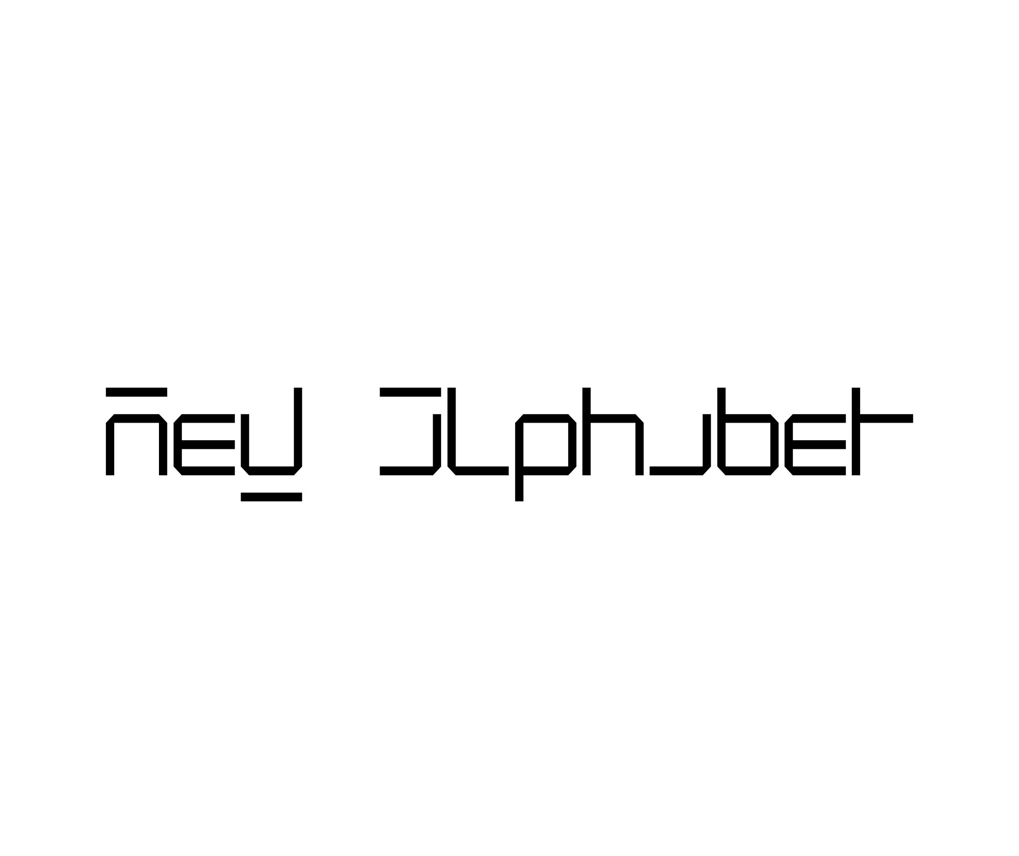
It is a long time ago, my new alphabet: 1967 was the year of publication. In thirty years a lot has changed and is even difficult to recollect the motives why I ever designed it. Looking back it seems ridiculous. Basically I experimented with type and words already from 1955 onwards. I was intrigued both by the structural experiments of the De Stijl movements and by the purifying direction of the later Bauhaus in Dessau. In the sixties I became highly interested in visual structuralism, something that was in the air.
To me it resulted from working along typographic grids and trying to find the ultimate consequences of structuralism. Learning from architecture, I imagined a book or publication as a 3 dimensional product, where each position stood in a specific relation to any other position. A book is not a sum of single pages or double spreads, but a three-dimensional object. For a lecture I prepared in that period, I made special slides visualising my point of view; some of those I still keep as some sort of nostalgic token. Even type can be looked upon as a 3 dimensional object. All this occurred to me, with a vague notion of the bit-sphere in computers; I really didn't know too much about it.
In 1966, at the DRUPA (1). in Dasseldorf, the annual exhibition on print and paper, I attended the launch of 'Digisett', the first electronic typesetter by Hell.
Observing the results of this machine, and thinking about the way type was reproduced here, I became highly intrigued by this bit-technique. Typefaces drawn by hand and engraved in metal; then carted in an alloy of lead and softened by the many times it was used, had a very specific character and flavour. And here we saw a reproduction of that process, via the electronic brain of this machine, build up in little dots within a rigid grid.
It used more or less the principle of the old Jacquard textile machines, where each pattern is translated in a square grid and punched in a band of cardboard for reproduction. I saw the resemblance with the typefaces my grandmother embroided in little cross stiches on her embroidery canvas. From Kurt Weidemann I saw around this time his beautiful collection of 19th century text-canvasses. All in all I became very interested in all sorts of modular techniques to reproduce typefaces, such as through bricklaying and through tiles. I made many slides for my collection. It all fitted in my fascination for the cellular world; for that visual structuralism. Also an early book on the subject of computer typesetting, published in 1966, made me aware of the many difficulties that still had to be overcome.
Typefaces, reproduced by the Hell Digiset tried to look like century-old faces, but failed to do that as regards to those specIfic characteristics I mentioned before. If you studied the digital products through the magnifying glass, something odd could be seen. Small sizes, compared to bigger sizes, seemed all different; especially round shapes changed into completely different silhouettes. Only straight lines kept their form. The whole complex of visual contradictions, and the conflict between old conventions and new techniques, convinced me that possibly a time had arrived for different way of thinking. Possibly even a new typeface-system.This is how l arrived at my experiments. First all sorts of trials and experiments. After some time the offer to publish the results in the ‘Quarterprints' of Pieter Brattinga.
I decided that my typeface had to be constructed from straight lines and 45 degrees corners. Following my interest in the 3-dimensionality of the book, all letters should have an even width, whereby spacing between words should always be related to the width of an individual character. Caps are indicated by a line on top of the character and 'double' characters such as the 'm' or 'w' are formed by a line through the single 'n' and ‘v’. In this way a text not only
has horizontal accentuation but also a regular vertical pattern. It is clear that it needs some training to read it! To me it was also clear that the typeface was not fit for use, but that it was designed for the sake of discussion. Furthermore, I gave an example of integration of type and illustration. Digital thinking included this, in my opinion; we should do away with separate blocks for text and illustration. I was convinced — from the beginning—that my experiments could never tear down the barriers of conventions that guarded over the existing typeface tradition. One cannot simply bend an age-old development. Still, I thought it must be possible to start a sensible discussion on how to face the new, and revolutionary, electronic developments.
since the new alphabet
CAT1
CAT2
CAT3